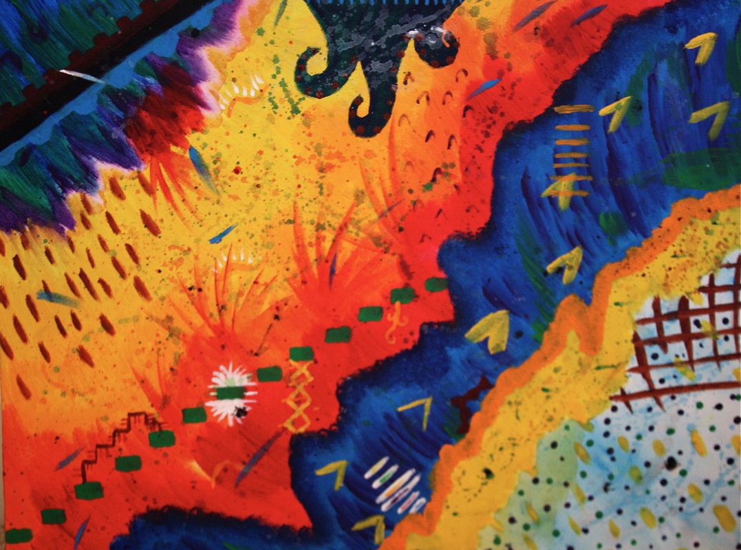
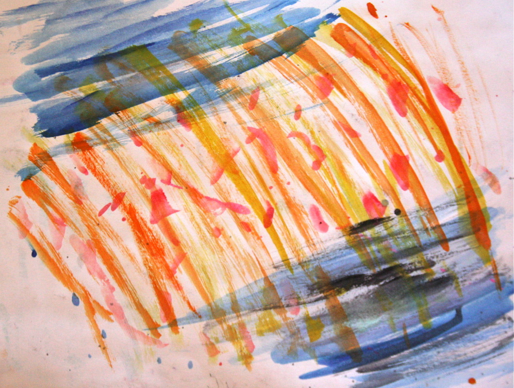
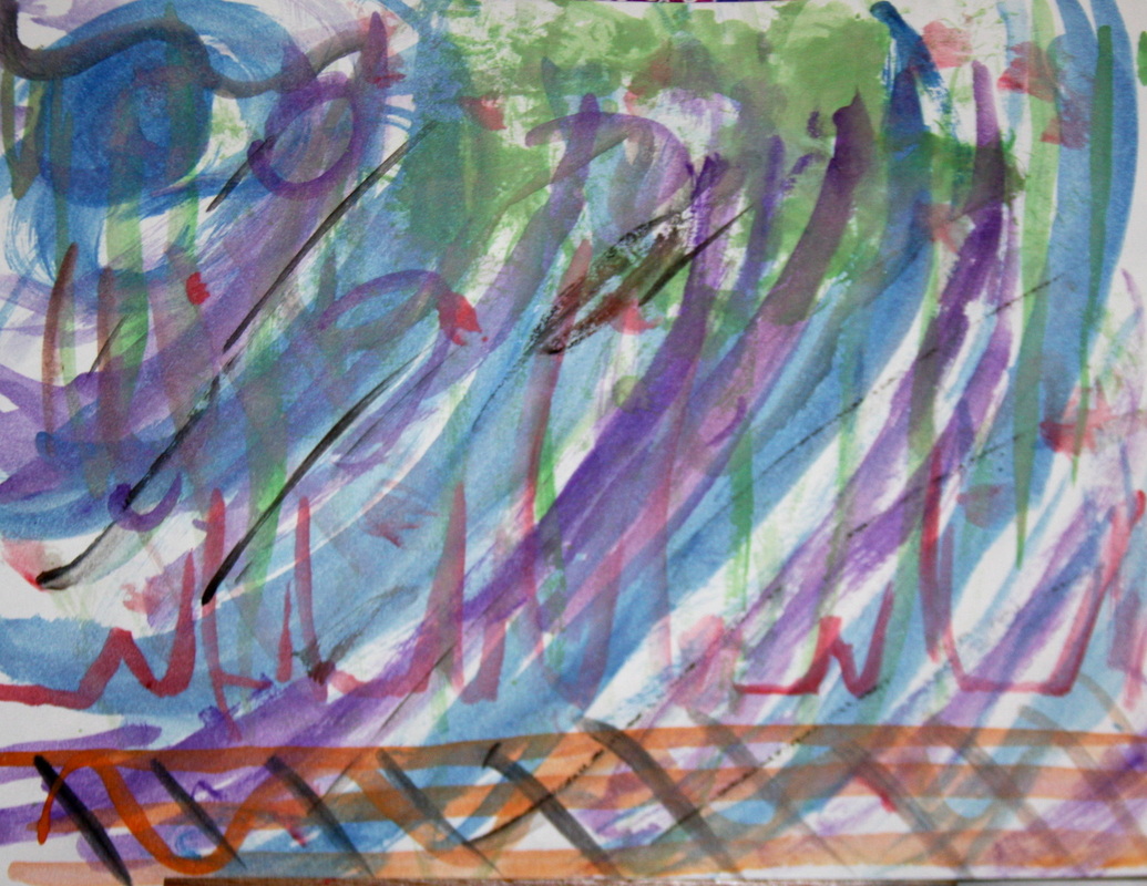
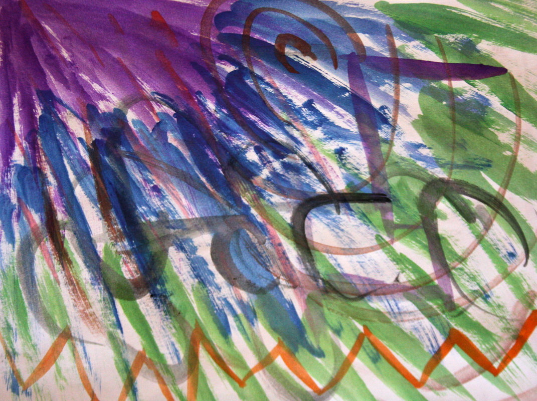
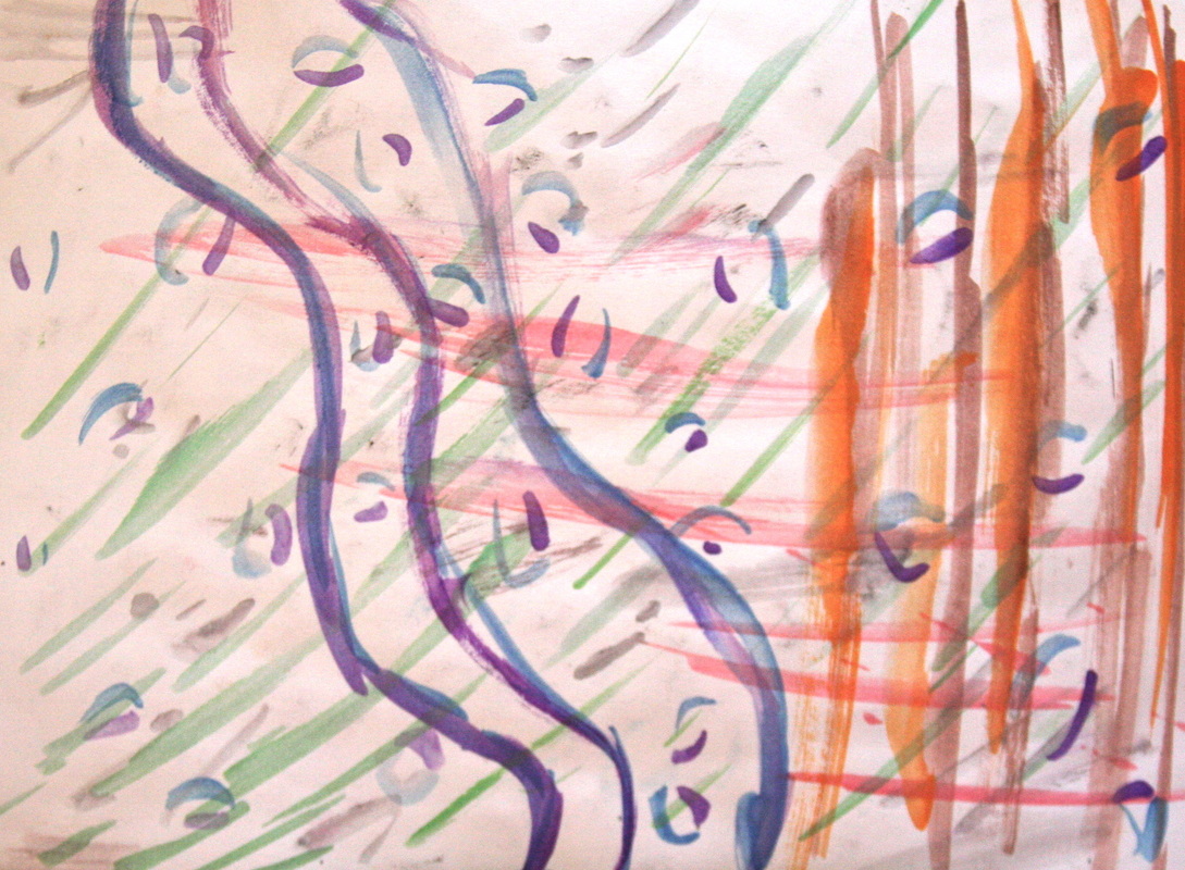
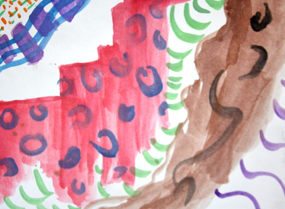
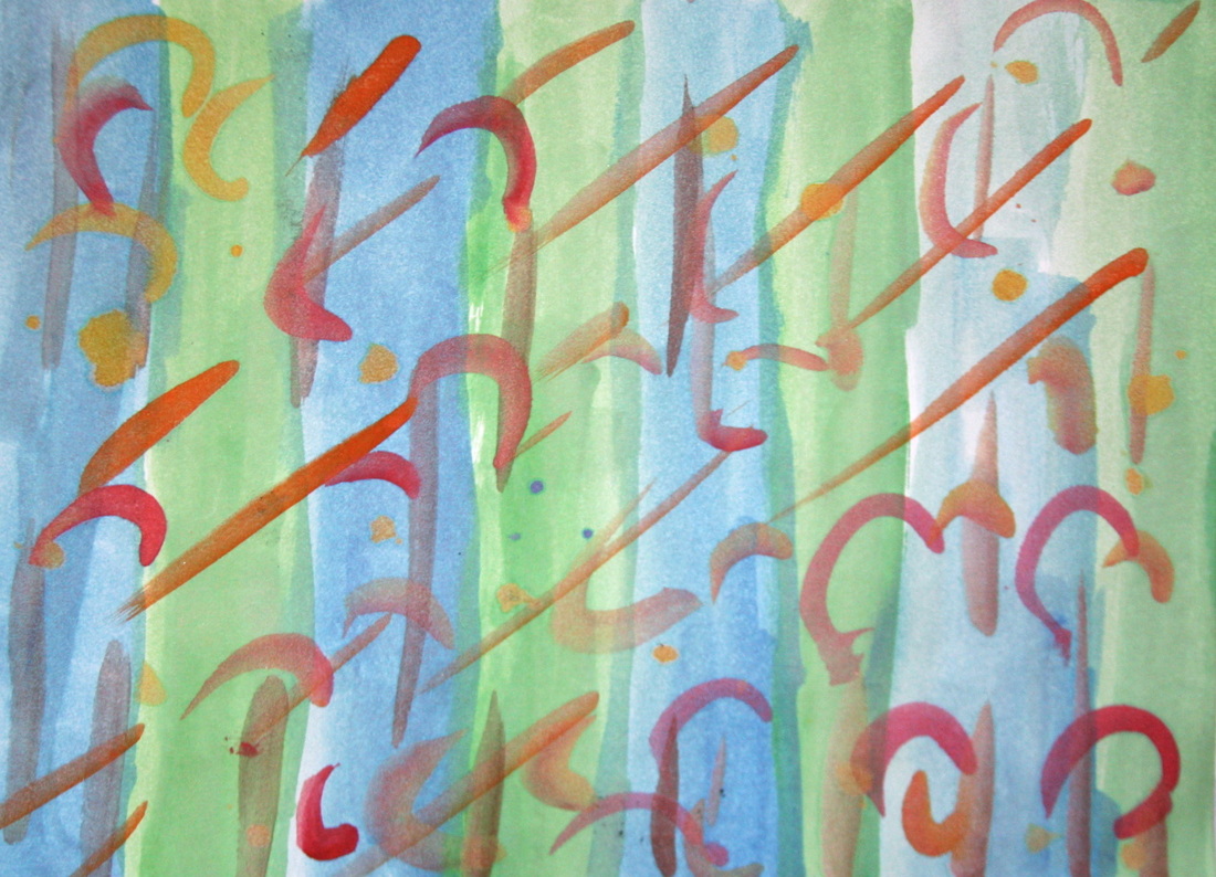
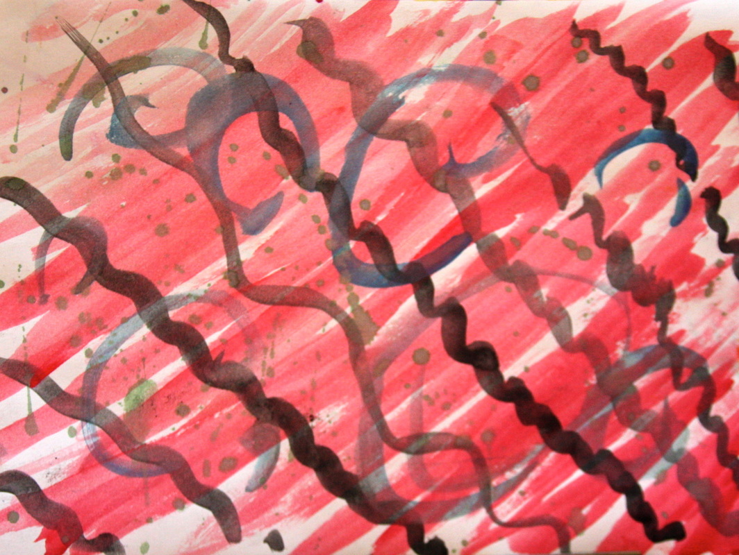
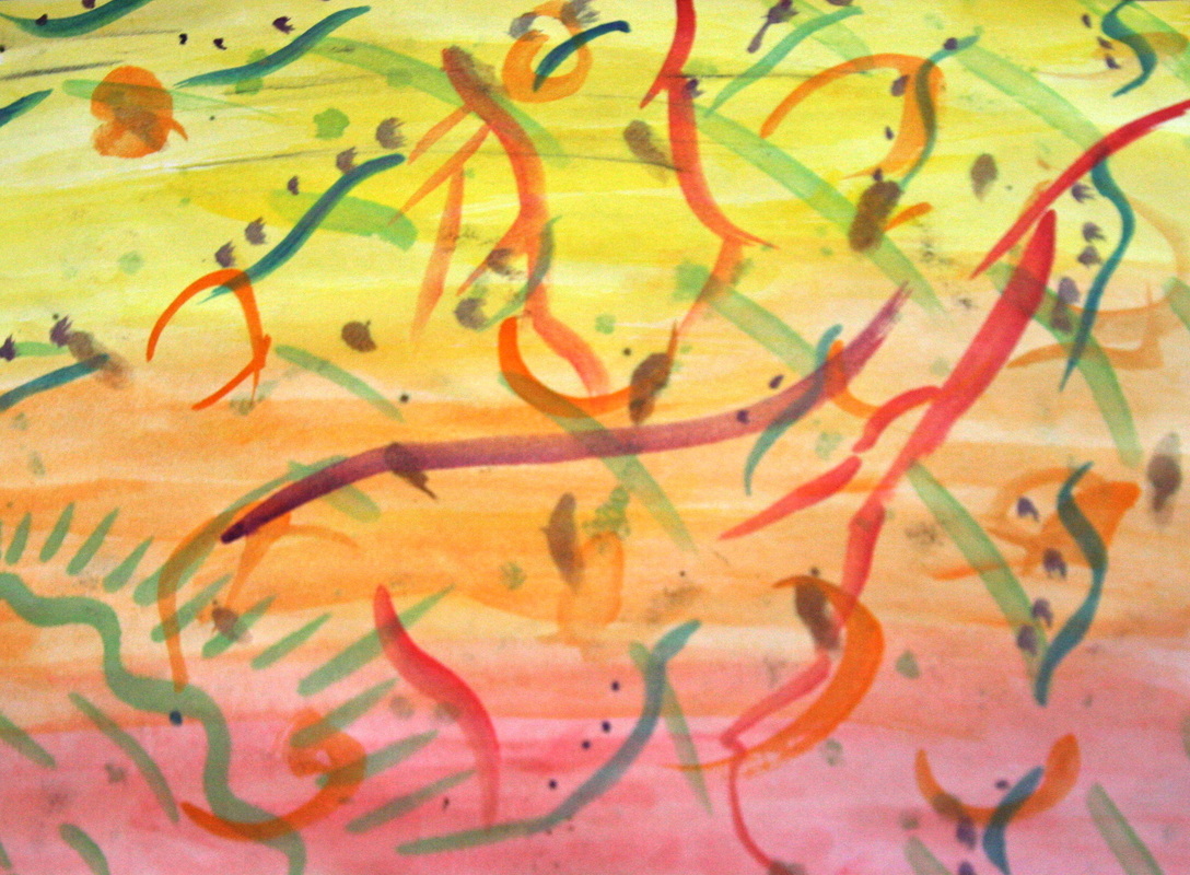
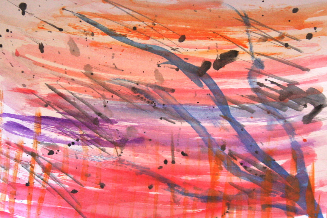
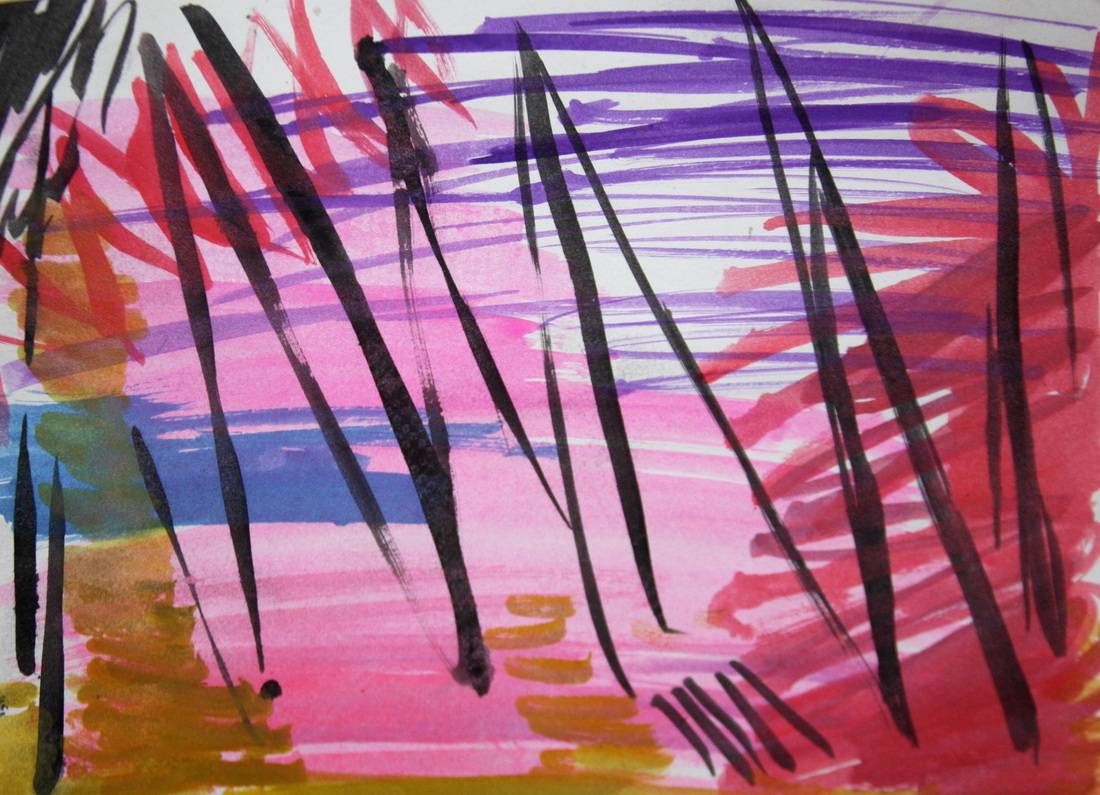
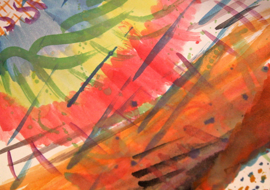
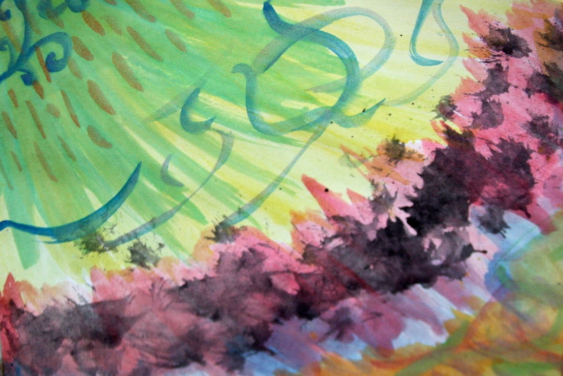
So after a week of painting I have finished my final piece for the paint a song project. I decided to do the painting like a time line of different layers. In the song there is four different sections of music that changes a lot from section to section. The beginning is slow and a little sad so I painted the top corner a mix of blue, green and purple. This part of the song, which is the first two minutes has a few patterns of music that the different instruments play over each other. To show this I painted two different lines of patterns that were connected to a black line. The white dash which goes through all three represents a single crash of a drum which always stuck out to me in this part of the song. When the song transitions to the next section it starts with the string section playing a sinister sounding few notes which I represented with the red area. The red then bursts into the next energetic area. For this part of the song it is very happy, bright and fast. So for my base I started with yellow and worked my way to red. To show the energy of this area I did a lot of different colored paint spatters, which was very fun. I also have the red exploding back toward the the yellow and orange. Even though it is a happy section I kept feeling the color blue so I added a swirling blue shape on the top. I also have different patterns through out like the brown dashes, blue half circles, and green dashes. Each of these shows a different musical area in this section of the song. I wanted this area to be just as high energy as the song was. Then starting around the 5 minute mark the song changes again, becoming slower and more like the colors blue, green and purple like the beginning of the song. But it is still happy so I added yellow arrows and a yellow and orange section to the bottom. Even though this area is slower it still has energy so I continued with the paint splatters. During this area one part repeats, it is the horns who seven loud notes repeatedly with pauses after each time, to show this I have seven orange lines progressing down the area. The last section consists of happy piccolo strings for the last 30 seconds or so I painted a variety of dots and dashes. At first it was on a white background that called for too much attention so I added a layer of very watered down blue to add to the calming feeling that this part of the song represents.
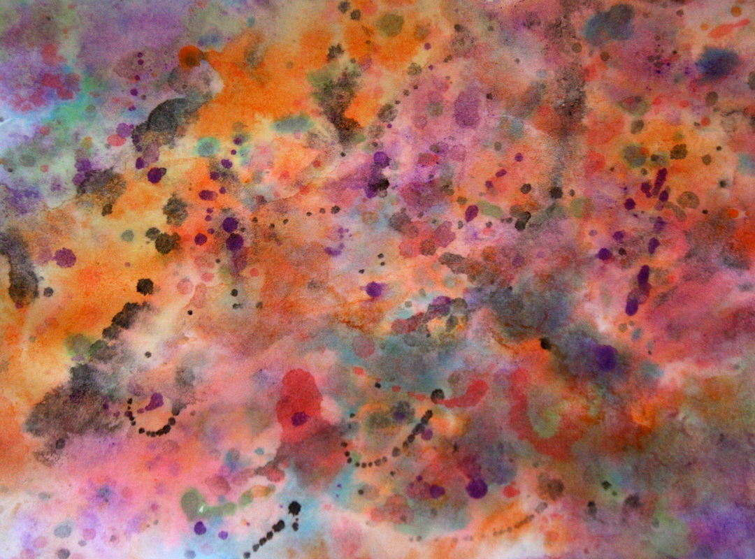
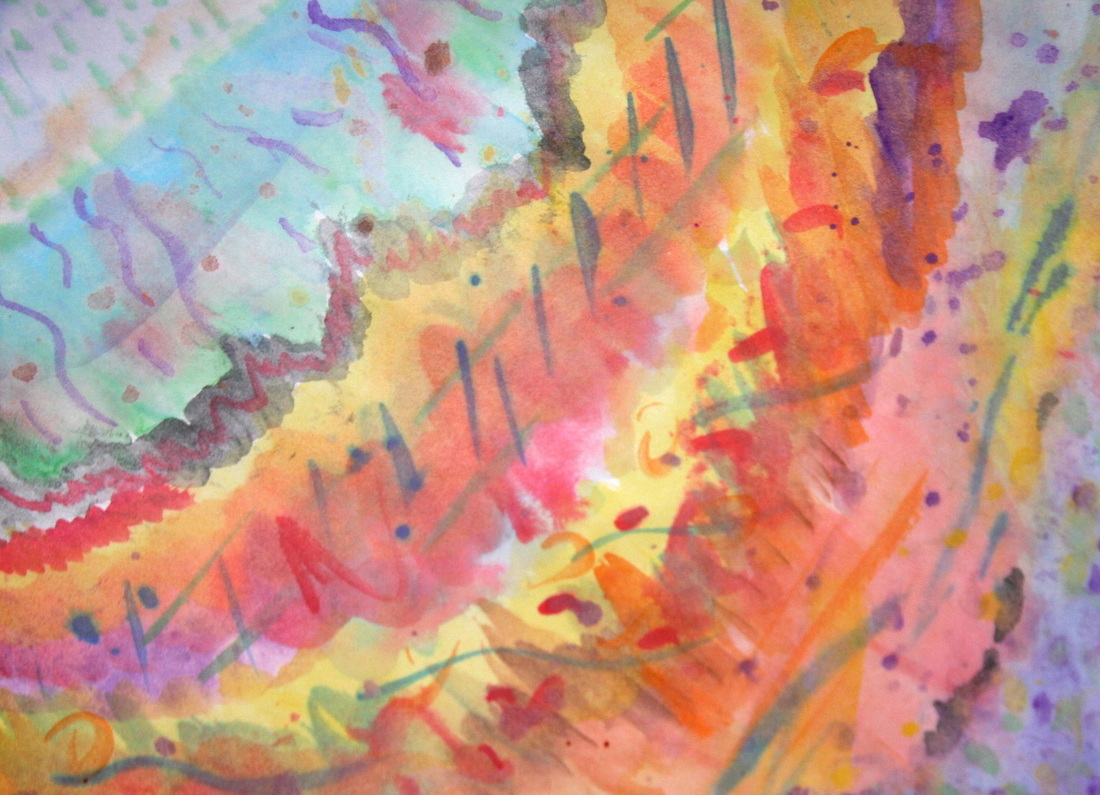
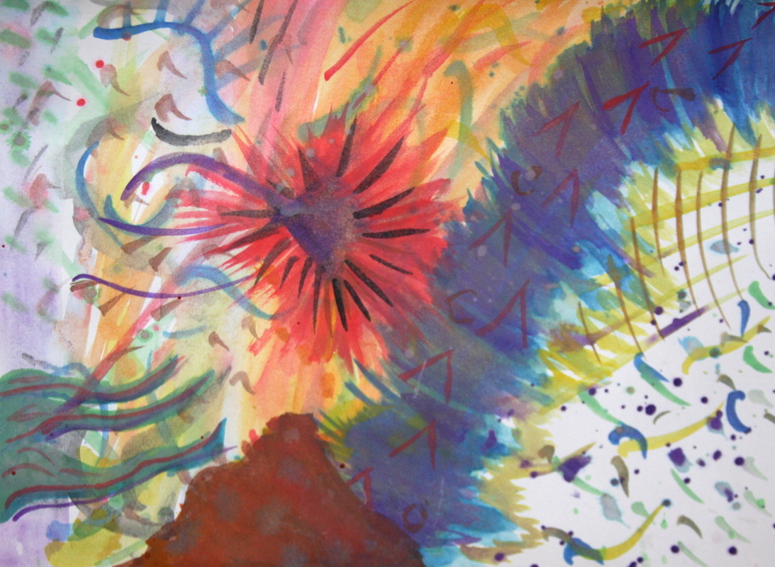
I decided to paint the song "Run Free" by Hans Zimmer. I chose this song because it has no lyrics and it has so many layers which change as the song progresses. So I did a few watercolor paintings of the song, all in different styles. The first one I did a time line where I listened to each minute over and over as I added all of the layers before I listened to the next minute. In my second one I put water on the whole page before spilling colors that fit the song. These were both good bases but in my final I will need to add even more layers and details. I am currently working on another watercolor that has more layers than the first. These paintings are so much easier than the first time I tried painting a song because I don't have a limited amount of time to paint.
So to get a feeling for this project we had to paint a bunch of different songs. This was really hard because we only had the length of the song to paint and most of them I have never heard of before. My first few paintings had a lot of white space, and we are supposed to cover the whole page unless the white space is artistic and intentional. After a few songs it got much easier to fill the page and try to convey a song. I was so glad when I song I knew came on because I knew how the song progressed making it easier to plan out my painting. The second day of the paintings we got to listen to the song once before we got to paint. This was so much easier because when you know how a song changes as it progresses to plan what you are going to put on paper.
Our final project is to paint a song. But it has to be non-representative. Which means if it was a song that was about the woods, you couldn't paint trees and if it made you think of birds you couldn't paint that either. Instead we have to paint the mood and feelings that the music and lyrics (if it has lyrics) gives off. This project seemed kinda easy at first, but when I thought about it I realized that this is going to be a difficult project. And it is going to be hard to find a song that is paint-able and isn't my favorite song, because I will be listening to it over and over and over and over and over and over again, which tends to ruin a song...
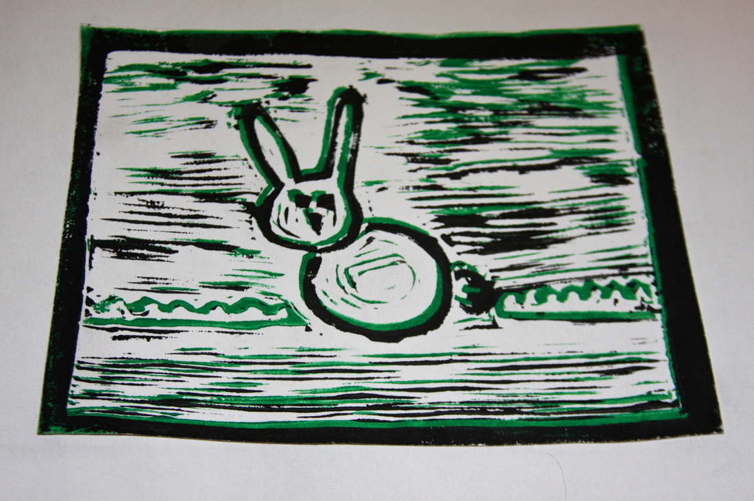
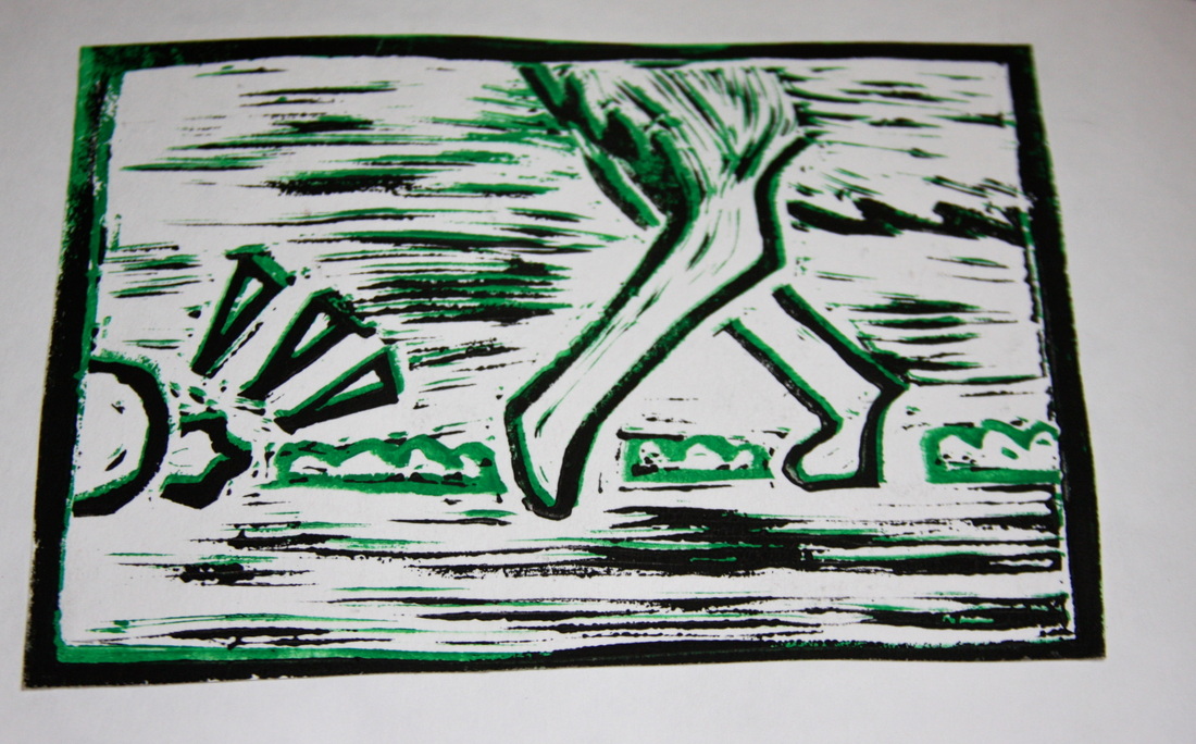
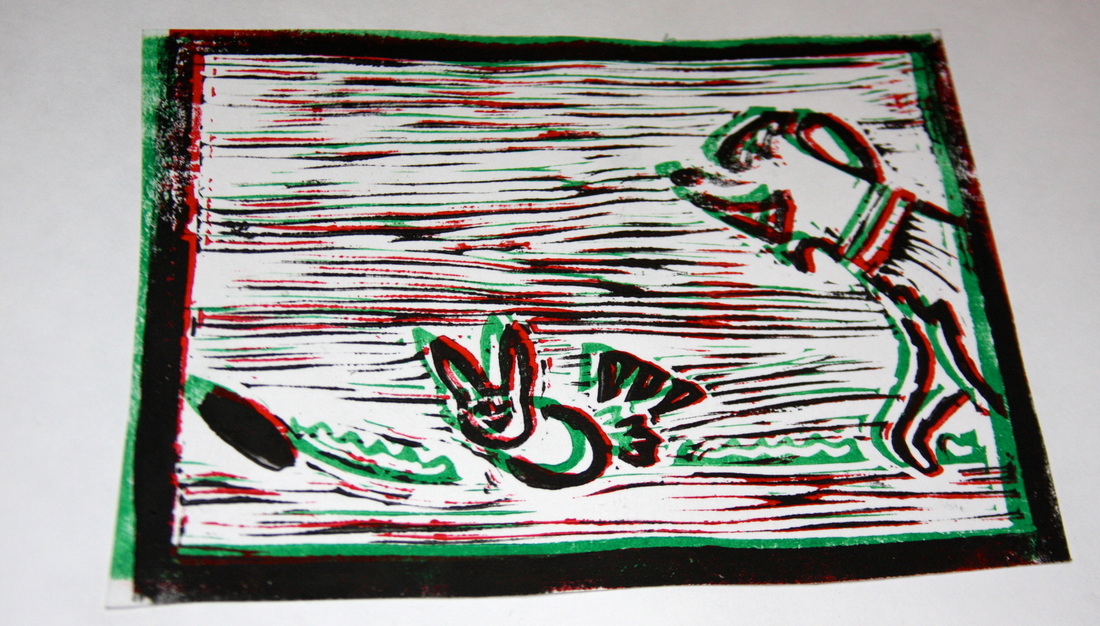
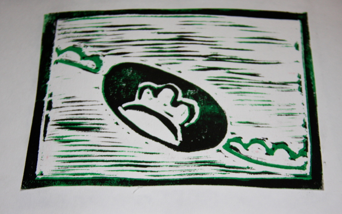
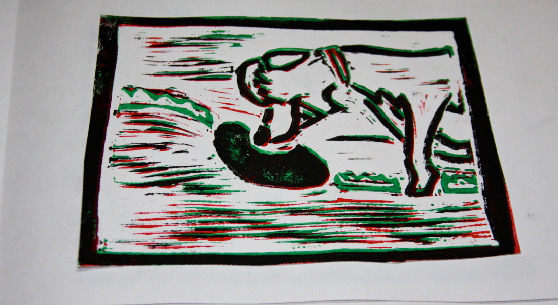
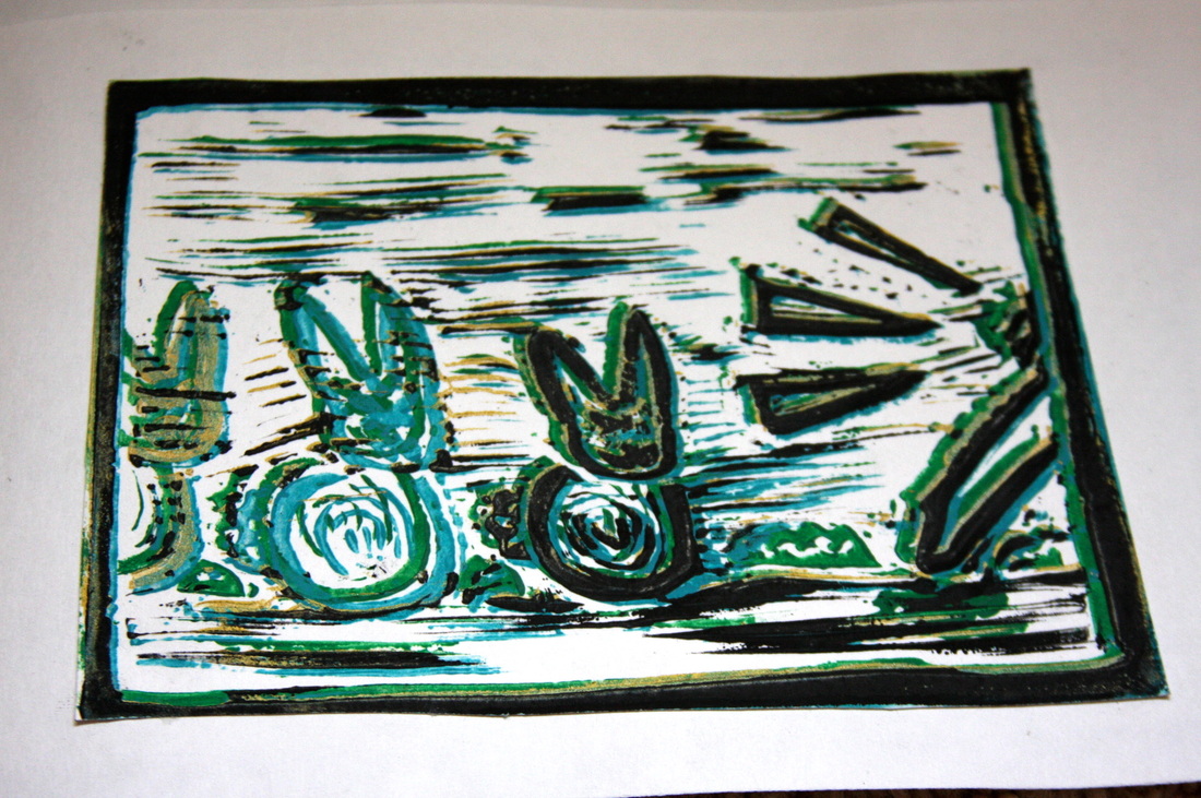
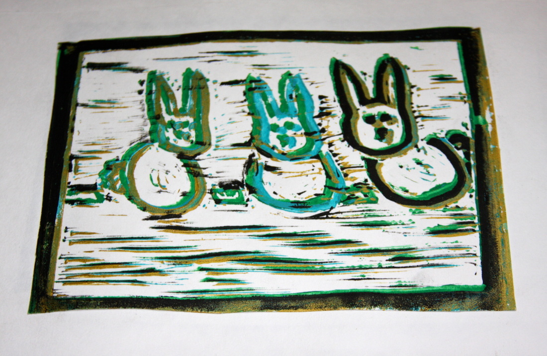
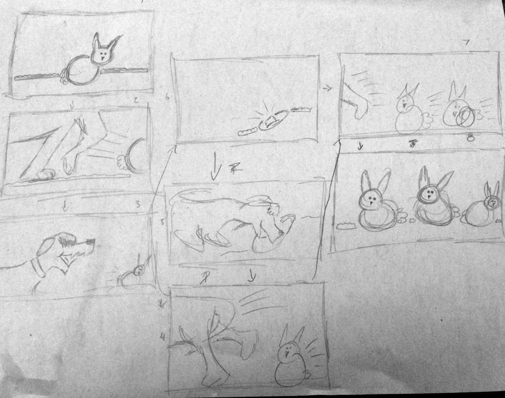
I finally finished my final prints. It turns out that we aren't binding them in class, but I might stay after to bind them. When I was carving my block I messed up at the very beginning. So I wanted the grass to be solid green and the collar to be solid red, but when i was carving out the white areas I carved out the inside of the grass and collar. So instead of being solid, they are outlines, which actually works with this style. So it wasn't that bad of a mistake! It was strange to see the prints at first because they looked backwards to me. And I relived why I am not a huge fan of printing, trying to get the second layer perfectly on top of the first is nearly impossible! I was originally only going to have three colors: black, red and green. But I decided that more colors would be more fun so each rabbit is a different color. All together I am pretty happy with the outcome of this piece.
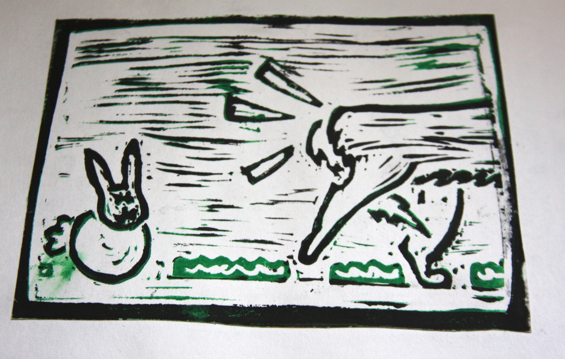
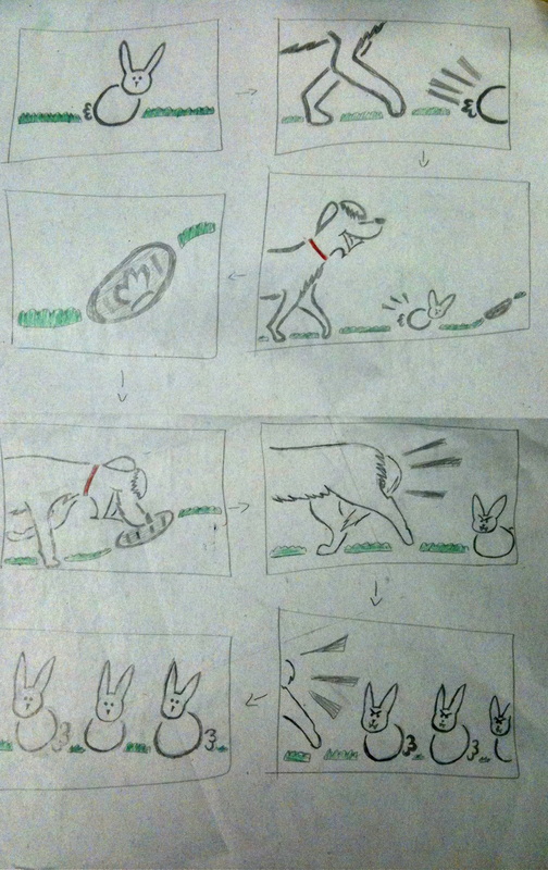
So I did a lot to improve on my original design. First I thickened all of the lines so it would be easier to carve out. I was considering adding more to my piece to add a bunch of different layers and colors but I ultimately decided against it, I wanted to keep it very basic. So the only colors I am using are green for the grass and the dog's (I am naming him Hugo) collar. Also when the ravenous rabbits chase Hugo, they didn't look very ferocious. So I gave them fangs and angry eyebrows to make them look scary. Apparently we need to have a border around each print so they don't slide around the paper so I will have to add those. Another change I made was on the rabbit hole. It looked more like a football so I think that I will color it in.
Coming up with an idea for this was a lot harder than I originally thought it would be. My first idea was inspired by the YouTube video "Billy's Balloon". I wanted to do something that is funny but sad at the same time so I had an idea to have a race, in which the main character trips right before the finish line. Unfortunately this would have been way too complex to do a block print on so I scraped the idea. I finally was inspired by my dog who I saw chasing after rabbits in my yard. And because I wanted to keep some comedy in this piece I came up with the following idea: First it is just a happy bunny, but then a dog goes chasing the bunny into its rabbit hole. Then the dog sticks his face into the hole in search of this bunny or the way to Wonderland (we will never know) but then gets chased after by a pack of ravenous rabbits who, after the dog has run off, enjoy basking in the sun while waiting for their next victim.
Our new project is to make an eight page book with block prints. I am quite excited to bind the books! Anyway, our prints just can't be anything they all have to relate to each other in some way. So it can be a story (I want to do this one), a gradual reduction print, or any thing else that makes them go together. I think it would be most fun to tell a short simple story, although I don't know what my story would be about. The only part I am worried about is the actual carving because if you make a mistake, it is permanent. For this project we are only allowed one rubber sheet which is roughly the size of a sheet of paper and pretty thin. So to make eight different prints i will divide it into four pieces and use the front and back of each print. This means I will have to be extra careful not to carve all of the way through the sheet.
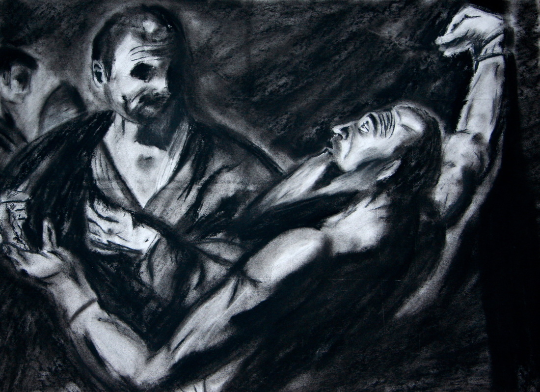
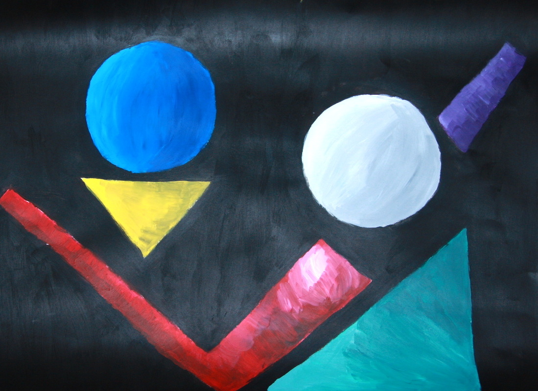
So I finished my two final pieces! I really liked how these turned out. My first final was the charcoal drawing. This one was just a pure recreation of the original painting. It accomplishes the goals, because it accurately represents the painting. After much trouble I got the proportions correct! Which for me is a miracle. When I first did this I kept Saint Bartholomew's face very light to make it the focal point, but I ended changing it and making it darker which added so much drama to the painting, and even though his face was darker, Bartholomeu was still the focus of this drawing. Also I made the two figures in the background fuzzy because I did not want to draw attension to them. I was super proud of this drawing, I can actually use charcoal affectivly. My second recreaton was done in another style, abstract. I took out some elements of my sketch because I wanted to keep it super simple. For the black background I added red to my second coat of paint so that it wasn't so flat. When I first painted all of the shapes they were flat, boring, and one-dimensial. So to add deph I shaded them. This was super easy to change the circles into spheres because they were already round. It was much more difficut to make the shapes with hard edges appear round so they would resemble the curve of an arm and so on. I, after many layers of paint, finally achieved this for all of the other shapes.
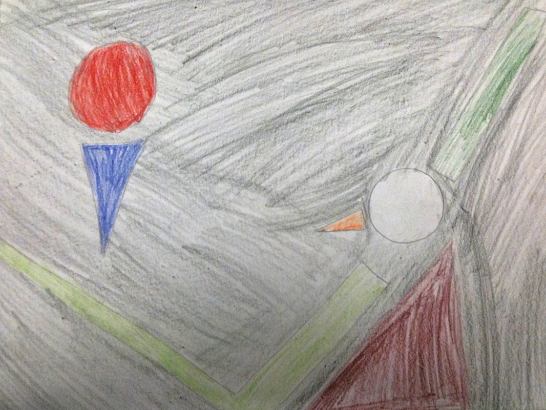
So I re-drew my third thumbnail sketch and colored it. I decided to go with a black background because the original painting had a dark background. Also this will allow all of the shapes to stand out. I recently decided that I don't like the other colors I chose. I will keep the circle representing the saint's head white to make it stand out, but I decided to take out his beard. It just didn't work. The man with the kinife, and Bartholomeu's back I will choose dark colors because in the orginal painting those are darker parts. Also I have too much empty space so I will make all of my shapes bigger. Like the check mark that makes up an arm, I will make the top wider because in the original painting his shoulder takes up quite a bit of room.