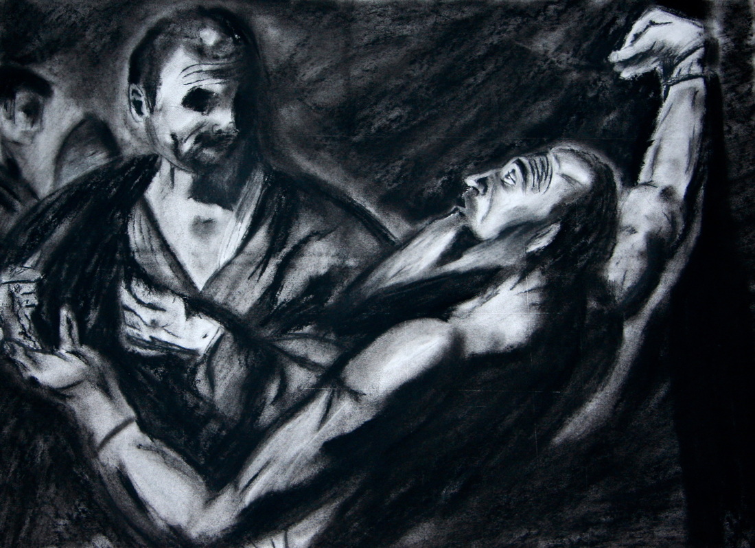
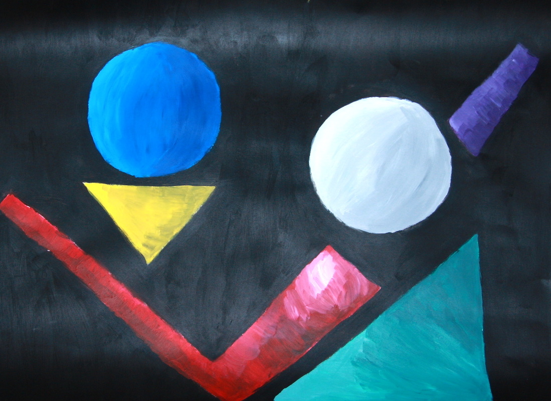
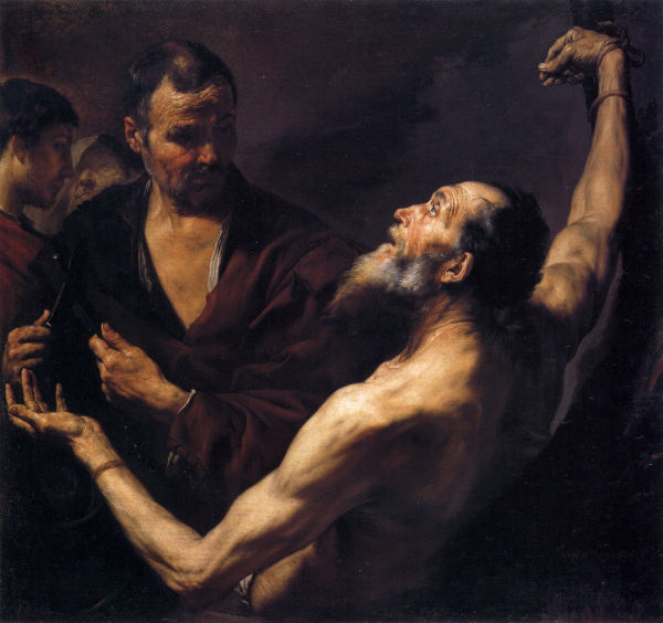
So I finished my two final pieces! I really liked how these turned out. My first final was the charcoal drawing. This one was just a pure recreation of the original painting. It accomplishes the goals, because it accurately represents the painting. After much trouble I got the proportions correct! Which for me is a miracle. When I first did this I kept Saint Bartholomew's face very light to make it the focal point, but I ended changing it and making it darker which added so much drama to the painting, and even though his face was darker, Bartholomeu was still the focus of this drawing. Also I made the two figures in the background fuzzy because I did not want to draw attension to them. I was super proud of this drawing, I can actually use charcoal affectivly. My second recreaton was done in another style, abstract. I took out some elements of my sketch because I wanted to keep it super simple. For the black background I added red to my second coat of paint so that it wasn't so flat. When I first painted all of the shapes they were flat, boring, and one-dimensial. So to add deph I shaded them. This was super easy to change the circles into spheres because they were already round. It was much more difficut to make the shapes with hard edges appear round so they would resemble the curve of an arm and so on. I, after many layers of paint, finally achieved this for all of the other shapes.
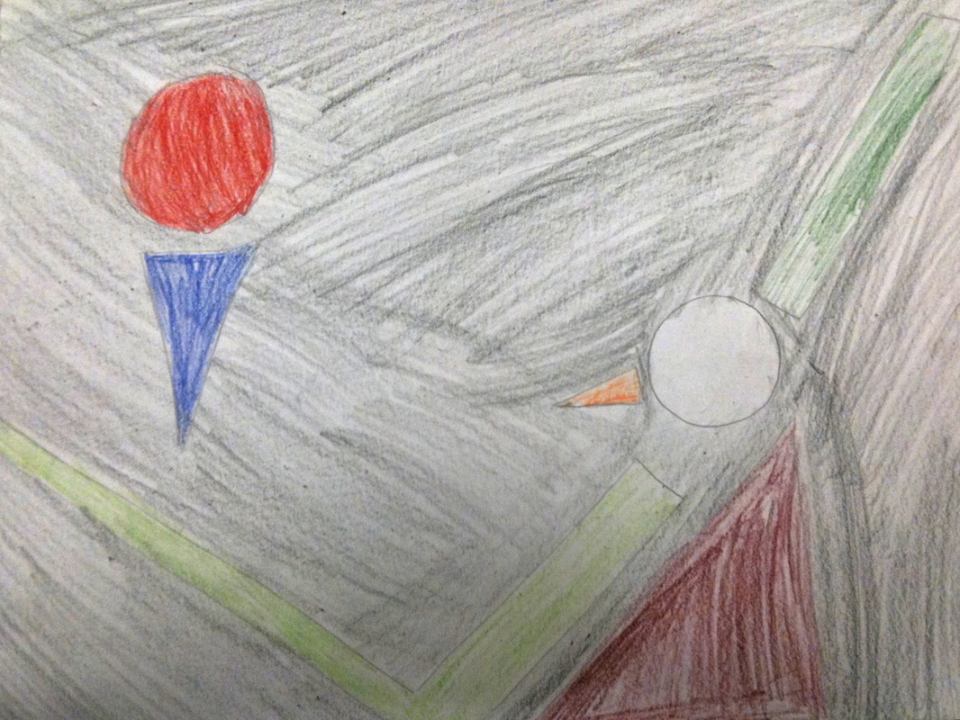
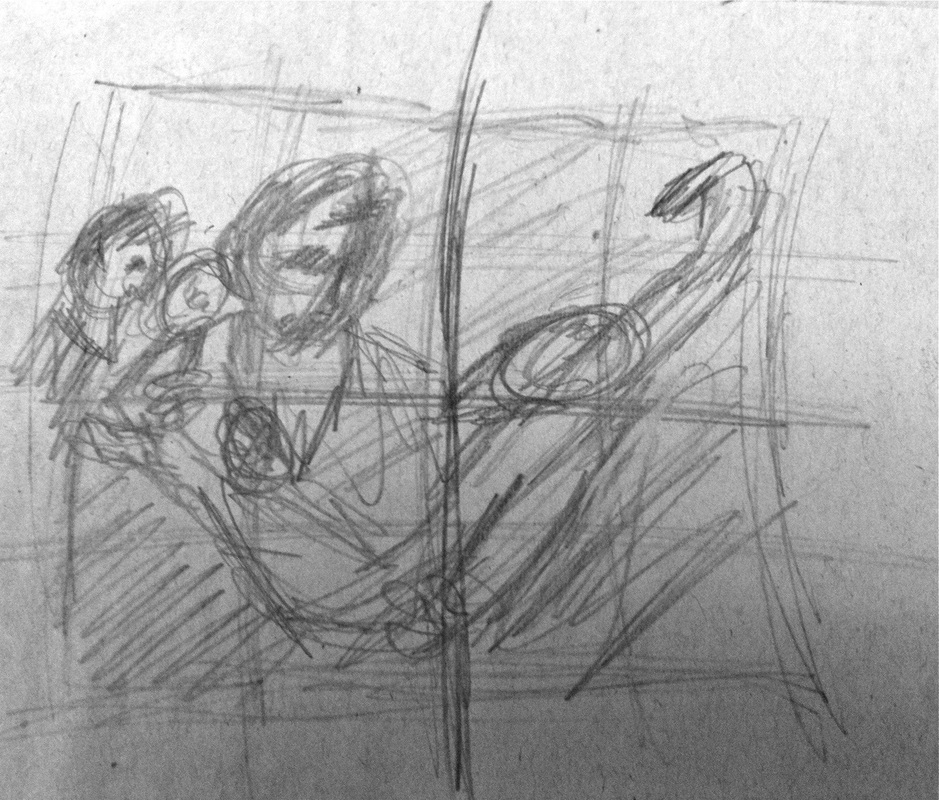
So I re-drew my third thumbnail sketch and colored it. I decided to go with a black background because the original painting had a dark background. Also this will allow all of the shapes to stand out. I recently decided that I don't like the other colors I chose. I will keep the circle representing the saint's head white to make it stand out, but I decided to take out his beard. It just didn't work. The man with the kinife, and Bartholomeu's back I will choose dark colors because in the orginal painting those are darker parts. Also I have too much empty space so I will make all of my shapes bigger. Like the check mark that makes up an arm, I will make the top wider because in the original painting his shoulder takes up quite a bit of room.
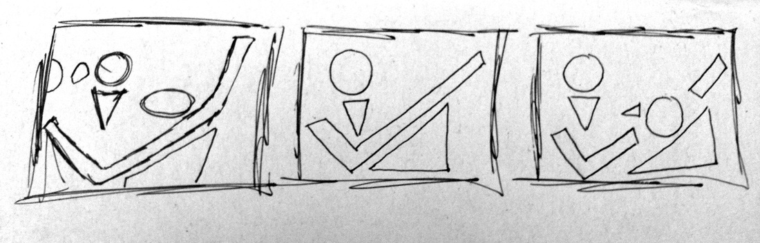
For my recreation in a different style I chose abstract because the original painting is so realistic. Also it turns out that this part of the project is not in charcoal as originally thought but in paints! But my sketches are not in color because I was just bouncing around ideas. In this painting I want it to be simple and still resemble the original painting. My first small sketch I don't like very much, it has too many componets and it is not very geometic. So I decided that instead of including all four figures I would only highlight the two main characters, Saint Barthlolmeu and the man with the knife. The second sketch wasn't was I was looking for either. In this one the figure that would be the man with the knife is too prominant and draws too much attention that shoud be towards the saint. The third is my favorite although I will be making changes to it. I decided to pick a few parts that were very prominant in the original to highlight in my painting. I chose the man with the kinfe's head and chest, and Saint Bartholomeu's head, arms, back, and beard. I will expand on this sketch by adding color and finilizing the different componets.
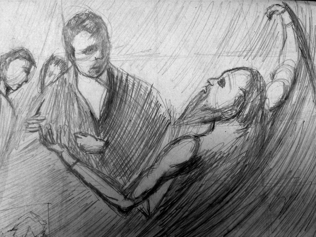
This is my finished sketch of the painting "Martyrdom of Saint Bartholomew". This is actually my second attempt at a finished sketch. The first one I was marrying the details and focusing too much on the small things. So for this one I ended tuning the picture of the painting I am recreating upside down to put my focus on the big picture and shades instead. Unfortunately my proportions were off even when I was using a grid. His near arm is not long enough. It doesn't meet the two sides of the paper that it should. I still am far from the quality I want in my final but for that I will spend much more time to make sure that all of the tones are how they should be if the painting was in black and white. But it is much improved from my thumbnail sketch. You can actually kinda see what is in the picture. When I did this sketch it bugged my how dark I made the Saint's eye so I will have to remember to lighten that up for my final piece. Also, much as I expected the hands I drew also didn't turn out, so I will be taking special care of those.
So this is a very, very rough sketch of my project. I was mostly concerned on the big shapes in the picture. I wanted to make sure that I would know the placement of the people in comparison to a different sized paper. I put next to zero detail in this sketch. Instead I roughly put in some of the different values. The darkest values will be in the corners, namely the bottom right side. Also the man who is apparently holding a knife will also be deep within the shadows making the main focus the man, Bartholomew. Obviously i will improve on this sketch by adding detail and darkening the shadows and making sure everything is in the right place. I was interested in what was happening in this painting so I looked up the word "Martyrdom". It turns up it means the death of a martyr, or someone who will die for a cause. So it turns out that this is a dark painting depicting the last minutes of St. Bartholomew, right before the shadow man with a knife kills him. Sad.
For our new assignment we have to take a painting and re-create it using charcoal. Then we have to do another charcoal drawing of the painting in an entirely different style. I chose to re-create "Martyrdom of Saint Bartholomeu" by Juespe de Ribera. The painting I am re-creating is down below. For me the hardest part of this assignment will be proportions. Firstly, the painting is square, but I am working off a rectangle piece of paper, so the re-creation is going have to be stretched. To help with this I divided the painting and my paper into 16ths. The painting also has two main figures, which will challenge me with their proportions. Also, they have hands. Hands are something I have been struggling with for a while. The painting is colored, but I will be working with the gray scale, so I will have to figure out what tones are the same and go from there.
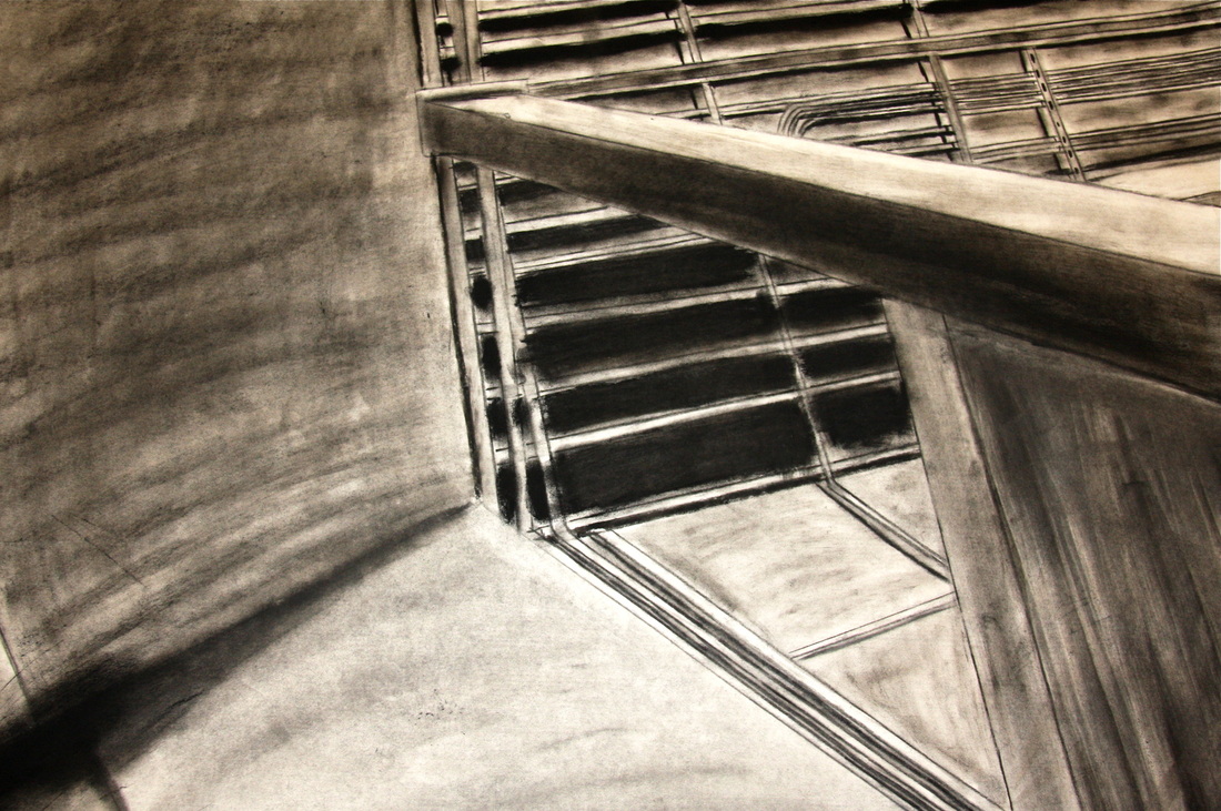
I finally finished my unusual angle drawing! I am very pleased in how it turned out. Although, this project was much more of a challenge than I thought it would be. I originally thought it would just be a simple, small three point perspective drawing. But it turns out our drawing had to be HUGE. On my small thumbnail sketch my vanishing points just barely fit the sheet of paper, so for my full size drawing two of my vanishing points weren't even on the table I was working on. And because there was no way my ruler would reach them I had to guess with the lines. This turned out to be a good thing because in the photo the lines do not go to a definite vanishing point. But then we also had to draw in charcoal! It actually is a very fun medium when your hair isn't in your way. But it was my first time using charcoal and I had no idea it gets everywhere; it is quite impossible to keep your paper free of fingerprints. The goal was to draw something ordinary in an strange way. I think I succeeded in this because by just looking at my picture it is difficult to tell what it is.